# 其他
这里会搜集一些有关CSS的零碎知识
# 重排(reflow)和重绘(repain)
重排:页面布局、几何属性发生改变;
重绘:由于元素的样式发生改变(或者由于重排)。
关系:重排必定导致重绘,但重绘不一定导致重排。
# CSS3的新属性
CSS3样式提纲:
- 圆角(border-radius)、阴影(box-shadow)、滤镜(filter)、文字省略(text-overflow)、渐变(gradient)、
- 动画(animation)
- 过渡(transition)、变换(transform)
- 新增盒模型——弹性盒模型(Flexbox)
- 新增box-sizing:content-box(即标准盒模型)、border-box(即IE盒模型)
# 盒模型
# 标准盒模型
width、height、padding、border、margin 五个独立,所设及所得。
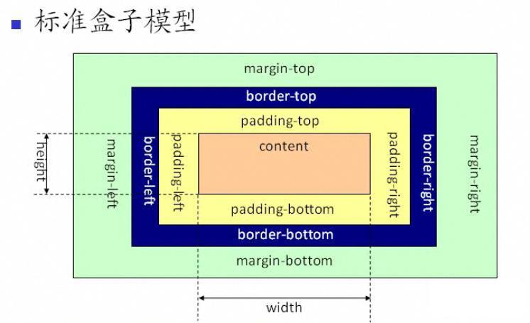
让浏览器只支持标准盒模型:
box-sizing: content-box
# IE盒模型
width(height)包括了padding、border,(margin依旧独立),故实际width可能会小一些
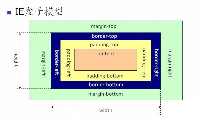
让浏览器只支持IE盒模型:
box-sizing: border-box
# 弹性盒模型
# 完美居中的方案
# 行内元素
- 水平居中:
/* A1 */
.parent {
    text-align: center;
}
2
3
4
- 垂直居中:
/* B1 */
.parent {
    height: 100px;
    line-height: 100px;
}

/* B2 */
.parent {
    display: table-cell;
    vertical-align: middle;
}
2
3
4
5
6
7
8
9
10
11
- 水平垂直居中:
/* 不兼容flexbox */
   /* `A1` 与 `B1/B2`混合搭配  */

/* 兼容flexbox */
   .parent {
       display: flex;
       justify-content: center;
       align-items: center;
   }
2
3
4
5
6
7
8
9
# 块级元素
- 水平居中:
/* C1 */
.child {
    margin: 0 auto;
}
/* C2 */
.child {
    position: relative;
    margin: auto;
    left: 0;
    right: 0;
}
/* C3 */
.parent {
    display: flex;
    justify-content: center;
}
2
3
4
5
6
7
8
9
10
11
12
13
14
15
16
- 垂直居中:
/* D1 */
.parent {
    display: table-cell;
    vertical-align: middle;
}
2
3
4
5
- 水平垂直居中:
/* 不兼容flexbox */
   /* `C1/C2/C3` 与 `D1`混合搭配  */

/* 兼容flexbox */
   .parent {
       display: flex;
       justify-content: center;
       align-items: center;
   }
2
3
4
5
6
7
8
9
# 粘性定位(Sticky)
Sticky是position的粘性属性。它是在static和fixed中切换,具体看是否要移出viewPort。
div.sticky {
    position: sticky;
    top: 10px;
}
2
3
4
也就是说:当滚动时,这个元素有移出的倾向,则切换为fixed(通过阈值来进行一些buff的作用)
- 阈值是:
top、bottom、left、right,必须设置四者之一 - 若设定了阈值为
top: 10px,则表示:当距离viewPort的顶部提前到10px的位置就切换fixed
注:该元素遵循
标准文档流,仍然保留元素原本在文档流中的位置
# Css-Hack
Css Hack指的是:当不同浏览器对某些css属性做解析,并出现差异的时候,去弥补这些差异的过程。
大致分为3种:
- 条件hack
<!--[if le IE 8]>
<style>
   .test2 {
       width: 100px;
   }
</style>
<![endif]--

/* 上面是表示当浏览器是小于ie8以下的 */
2
3
4
5
6
7
8
9
- 选择器hack
* html .test {
    color: red; /* For IE6 and earlier */
}
* + html .test {
    color: yellow; /* For IE7 */
}
.test:lang(zh-cn) {
    color: white; /* For IE8+ and not IE */
}
.test:nth-child(1) {
    color: black; /* For IE9+ and not IE */
}
2
3
4
5
6
7
8
9
10
11
12
- 属性值hack
#test {
    color: #c30; /* For Firefox */
    color: red\0; /* For Opera */
    color: yellow\9; /* For IE8 */
    *color: blut; /* For IE7 */
    _color: #ccc; /* For IE6 */
}
2
3
4
5
6
7
# 设置元素不可见的方法
/* 1 */
.child {
   display: none;
}

/* 2 */
.child {
   position: absolute;
   top: -999999px;
}

/* 3 */
.child {
   visibility: hidden;
}

/* 4 */
.child {
   opacity: 0;
}
2
3
4
5
6
7
8
9
10
11
12
13
14
15
16
17
18
19
20
# display: none与visibility: hidden的区别
| 区别 | display: none | visibility: hidden |
|---|---|---|
| 占据空间 | 不占据 | 占据 |
| 重排、重绘 | 重排又重绘 | 仅重绘 |
| 子孙元素 | 都不可见 | 可设置部分可见 ( visibility: visible) |
| transition效果 | 影响 | 不影响 |
# z-index和position的关系
z-index用于设置元素的堆叠顺序,堆叠顺序大 会处于 堆叠顺序小 的前面
它只在
position为absolute、relative或fixed的元素上有效
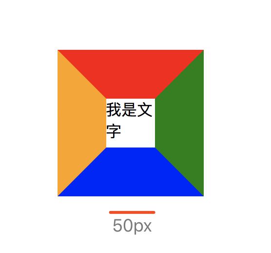
# 纯CSS画三角形
原理:
- 1、看清
border的四条边界
.child {
  width: 50px;
  height: 50px;
  border-top: 50px solid red;
  border-right: 50px solid green;
  border-bottom: 50px solid blue;
  border-left: 50px solid orange;
}
2
3
4
5
6
7
8
- 2、去除中间内容
.child {
  width: 0;
  height: 0;
  border-top: 50px solid red;
  border-right: 50px solid green;
  border-bottom: 50px solid blue;
  border-left: 50px solid orange;
}
2
3
4
5
6
7
8

- 3、再去除一部分(例如:将左边颜色设置
transparent)
.child {
  width: 0;
  height: 0;
  border-top: 50px solid red;
  border-right: 50px solid green;
  border-bottom: 50px solid blue;
  border-left: 50px solid transparent;
}
2
3
4
5
6
7
8

- 4、可以利用这个特性,画出
三角形、直角三角形、梯形等等
.child {
   width: 0;
   height: 0;
   /* border-top: 50px solid red; */
   border-right: 50px solid transparent;
   border-left: 50px solid transparent; /* 去掉这行,是个直角三角形(直角边为左下角) */
   border-bottom: 50px solid blue;
}
2
3
4
5
6
7
8
# 【布局题】利用margin/padding实现宽高自适应
如图:实现一个宽度、高度、间隙随屏幕大小自适应的布局:
<div id="app">
    <div class="top-wrapper">
        <div class="user-wrapper" v-for="item in arr" :key="item.id"></div>
    </div>
    <div class="bottom-wrapper">
        <div class="btn">底部按钮</div>
    </div>
</div>
2
3
4
5
6
7
8
.top-wrapper {
    display: flex;
    flex-wrap: wrap;
    justify-content: space-between;
    padding: 10px;

    .user-wrapper {
        display: inline-block;
        width: 23%; // 相对于父容器(即top-wrapper)宽度
        margin-top: 2.67%; // 相对于父容器(即top-wrapper)宽度
        background: green;
        overflow: hidden; // 触发BFC条件,撑开该容器

        &::after{
            content: '';
            display: block;
            margin-top: 100%; // 相对父容器(即user-wrapper)宽度
        }

        &:nth-child(1),
        &:nth-child(2),
        &:nth-child(3),
        &:nth-child(4) {
            margin-top: 0;
        }

        .user-text {
            position: absolute; // 文字需额外放到一个脱离标准流的容器中
        }
    }
}
2
3
4
5
6
7
8
9
10
11
12
13
14
15
16
17
18
19
20
21
22
23
24
25
26
27
28
29
30
31
大致思路:把参照物都设置成父容器的宽度
对于小方块的宽度自适应:
- 每行4个小方块,它们各自的宽度百分比
(相对于父容器top-wrapper宽度),单个为23%,所以父容器(top-wrapper)还剩余8%的宽度。
- 每行4个小方块,它们各自的宽度百分比
对于小方块的高度自适应:
- 因为每个小方块的高度参考物不是父容器宽度,不能直接设置百分比(因为画正方形,可
将高度的百分比参考物设置为也相对于父容器top-wrapper的宽度,可用margin/padding百分比)。 - 又因为每个小方块里面没有内容,所以需要用一个
伪类after把父容器高度撑开(此时每个小方块就是伪类的父容器),将伪类设为margin-top: 100%,这时伪类相对父容器(即小方块)宽度100%,自动撑开高度,数值和宽度一样。 - 有个要注意的点是,要触发小方块的BFC特性,才能把高度撑开。
- 因为每个小方块的高度参考物不是父容器宽度,不能直接设置百分比(因为画正方形,可
对于小方块的水平间距:
- 可以通过
justify-content: space-between来实现块与块之间的水平间距。
- 可以通过
对于小方块的垂直间距:
- 因为每一行有3条间隙,平分上面算的剩余
8%的宽度,算得约每条2.67% - 因为
高度不能直接设置百分比。把参考物换成父容器top-wrapper可以通过margin-top实现,即每个小方块margin-top: 2.67%(也是相对于父容器top-wrapper宽度),实现垂直间距
- 因为每一行有3条间隙,平分上面算的剩余
# CSS关系选择器
# >(子选择器)
- 注意:不包括 孙元素
<div id="a">
   <p>11111111111111</p>
   <p>22222222222222</p>
   <div>
    <p>333333333</p><!--该<p>在<div>中-->
  </div>
</div>

<style>
   #a>p
   {
       background-color: red;
   }
</style>
2
3
4
5
6
7
8
9
10
11
12
13
14

# +(相邻选择器)
- 注意:
紧密、且后跟着的那一个元素
<div id="a">
   <h1>11111111111111</h1>
   <p>22222222222222</p>
   <p>33333333333333</p><!--只会选择第一个相邻的匹配元素-->
   <div>
     <p>44444444444</p>
   </div>
</div>

<style>
   h1+p {
       background-color: red;
   }
</style>
2
3
4
5
6
7
8
9
10
11
12
13
14

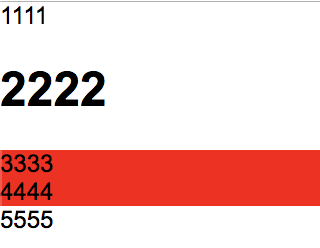
# ~(匹配选择器)
- 注意:后面的、且同级的元素
<div id="a">
   <p>1111</p>
   <h1>2222</h1>
   <p>3333</p>
   <p>4444</p>
   <div>
     <p>5555</p>
   </div>
</div>

<style>
   h1~p {
       background-color: red;
   }
</style>
2
3
4
5
6
7
8
9
10
11
12
13
14
15
# CSS选择器权重
从小到大:
标签选择器(`h1`) < 类选择器(`.example`) < ID选择器(`#example`) < style < !important
匹配选择器(
>、+、~) 对优先级没有影响
当圈中一样时,最后声明的会生效。
# 伪类、伪元素
- 伪类:定义元素的特殊状态
- 伪元素:添加装饰内容
它们的区别:
/* 伪类 */
button:hover {}
button:active {} /* 激活态。鼠标从 “按下” 到 “松开” 之间 的状态 */
button:focus {} /* 聚焦态:input获得焦点 */


/* 伪元素 */
button::after {} /* 在尾部创建一个伪元素 */
button::before {} /* 在头部创建一个伪元素 */
2
3
4
5
6
7
8
9
# :last-child
一般会用 :last-child 来给最后一个元素写样式。
不生效的情况:
/* 若同兄弟节点中,最后一个不是item选择器的 */
.item:last-child {
    /* ... */
}
2
3
4
5
# class的声明顺序对最终无影响
/* <p class="classB classA">123</p> */

<style>
  .classA {
    color: blue;
  }
  .classB {
    color: red;
  }
</style>
2
3
4
5
6
7
8
9
10
最终渲染: color: red
原因:最终渲染与 “class的声明顺序”无关 ,CSS文件内后面会覆盖前面的样式。
# margin、padding百分比
子元素的 margin、padding 都是相对于 父容器 宽度。
.parent {
    width: 100px;

    .children {
        margin-top: 50%; // 相对于 父容器 宽度
    }
}
2
3
4
5
6
7
# image-rendering
image-rendering 可以指定图像的缩放算法。
默认情况下,浏览器会采用标准的平滑缩放(通常是双线性插值bi-linear interpolation)。
例如,有一张
100x100px的图片。如果开发者设置成200x200px(或50x50px)。那么图片就会根据image-rendering指定的算法,进行缩小/放大到新尺寸。(没有缩放的图像不影响)
# 属性值
以下属性都可以禁止浏览器图像的平滑缩放。
img {
	image-rendering: optimizeSpeed;             /* Firefox老版                     */
 	image-rendering: -moz-crisp-edges;          /* Firefox 6.0+                   */
 	image-rendering: -o-crisp-edges;            /* Opera                          */
 	image-rendering: -webkit-optimize-contrast; /* Webkit:Safari、Chrome          */
 	image-rendering: pixelated;                 /* Chrome as of 2019              */
 	image-rendering: optimize-contrast;         /* CSS3 提案                       */
 	-ms-interpolation-mode: nearest-neighbor;   /* IE8+                           */
}
2
3
4
5
6
7
8
9
# 适用于
# 元素
<img><canvas>- 拥有
background-image属性的DOM
# 使用情况
- 开发
canvas时里,可能会实时缩放尺寸(需要保持canvas全屏时) - 二维码(需要全屏时)

如果只是单纯展示一张静态图片,可能不需要设置该属性。
# 参考链接
← 像素